Brief
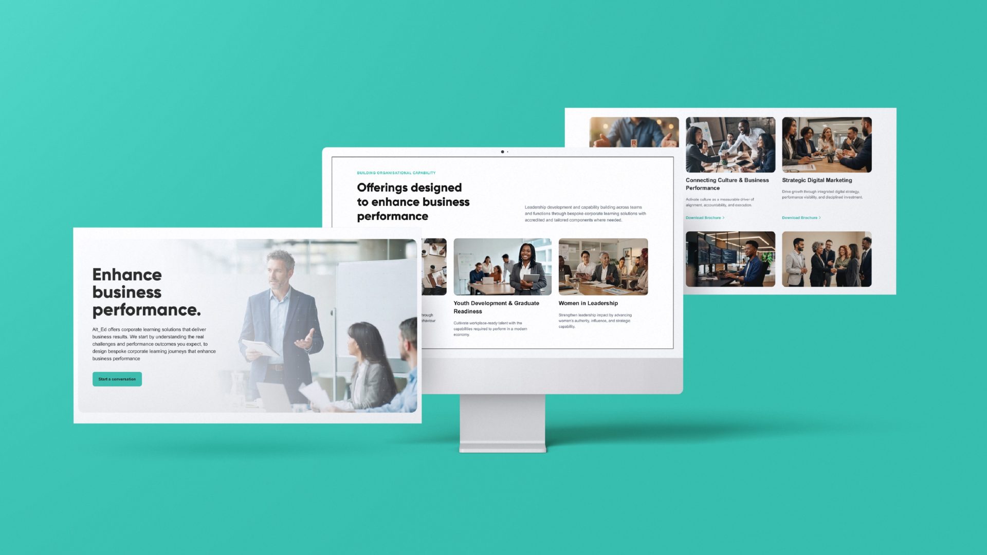
Alt_Ed, part of the Growth-Ten group, builds bespoke learning journeys for organisations focused on workplace impact and behaviour change. The methodology was proven and the client results were real. The website undersold both. Built quickly and never revisited, it was copy-heavy, fragmented, and gave no real sense of what Alt_Ed had actually achieved with its clients.
INSIGHT/CHALLENGE
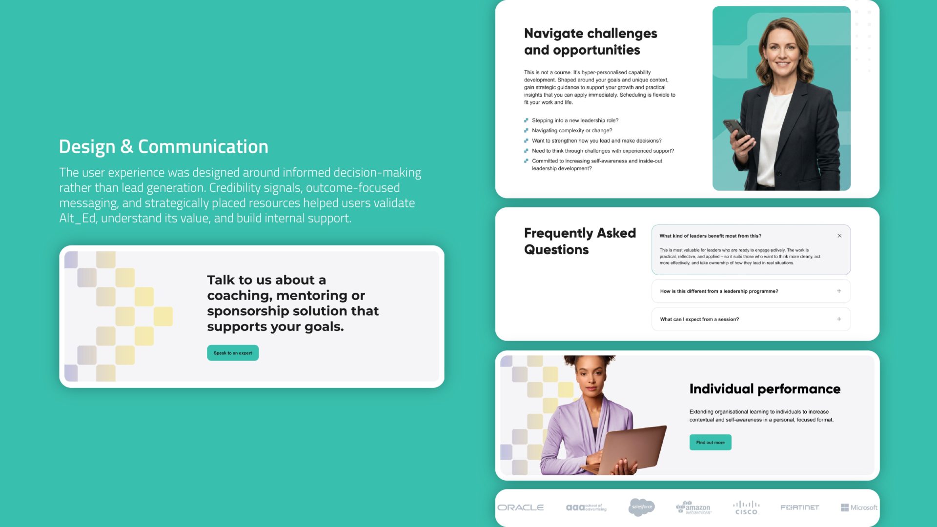
Alt_Ed’s growth runs through referral and internal advocacy rather than direct outreach, so the website wasn’t going to be the thing that closed a deal. It needed to do something harder to give someone else the confidence to make the case internally, after we were no longer in the conversation.
Our research backed this up. Most visitors were arriving through referral, not open search, and two audiences kept surfacing, each with a different job to do:
- HR and L&D professionals, evaluating development partners and building the internal evidence needed for sign-off.
- Time-poor executives, looking for a fast, credible read on organisational impact and ROI, without wading through programme detail.
STRATEGY
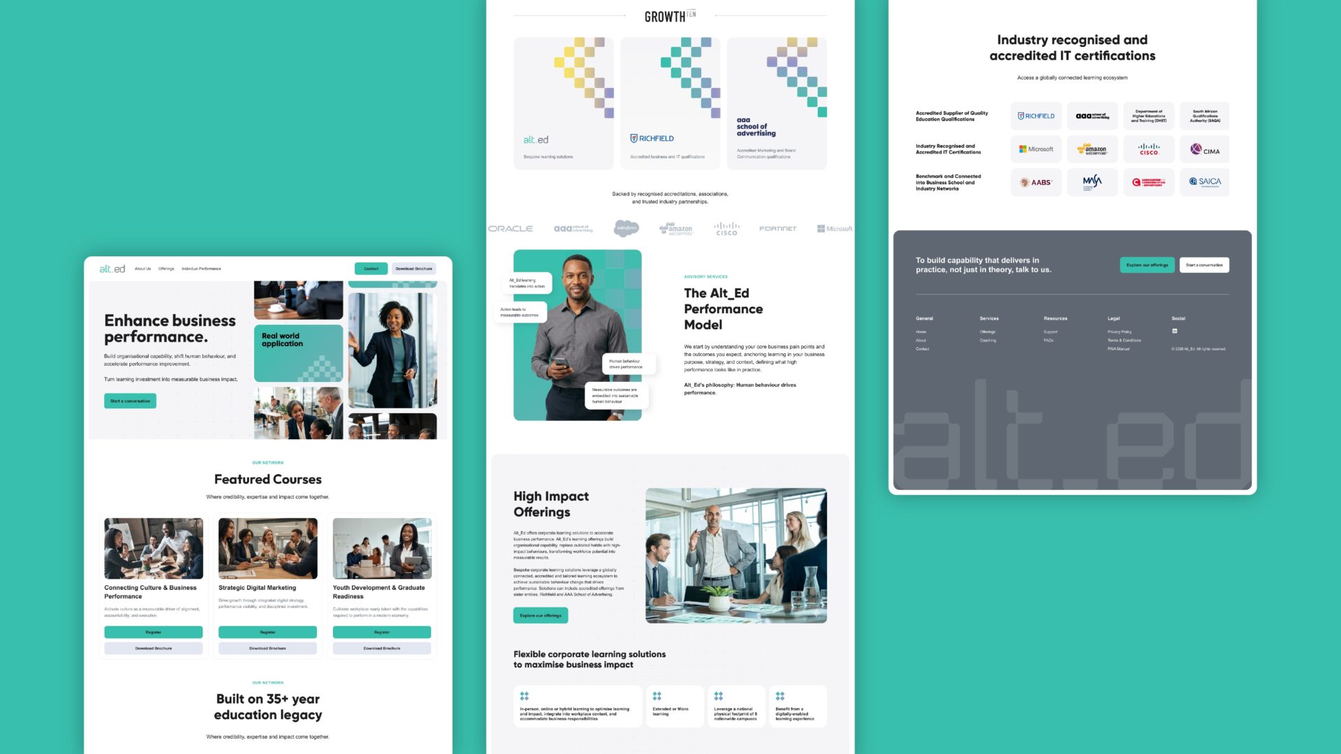
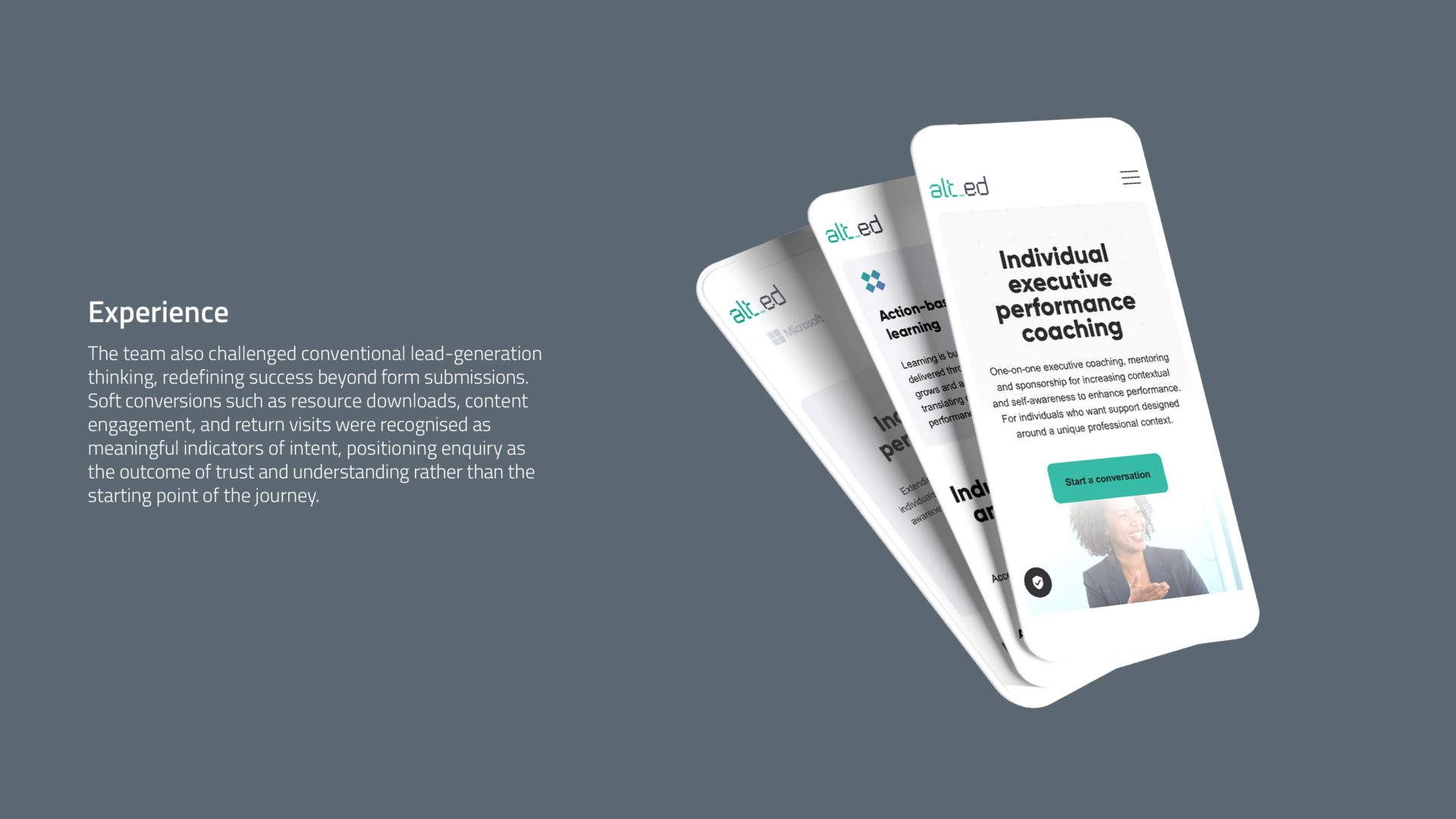
Positioning drove most of what followed. Alt_Ed needed to read less like a training provider and more like a partner organisations bring in to move the needle on performance, matching the sophistication of the consultancy itself. That shift changed how we defined success on the site. A form submission wasn’t the only outcome that mattered anymore. A resource download counted. So did a second visit, or real time spent with the content.
The bigger call was walking away from the programme-catalogue format most competitors default to, in favour of building the site to work the way a champion inside a client organisation actually needs it: as evidence they can use it to build their own case, on their own terms.
EXECUTION
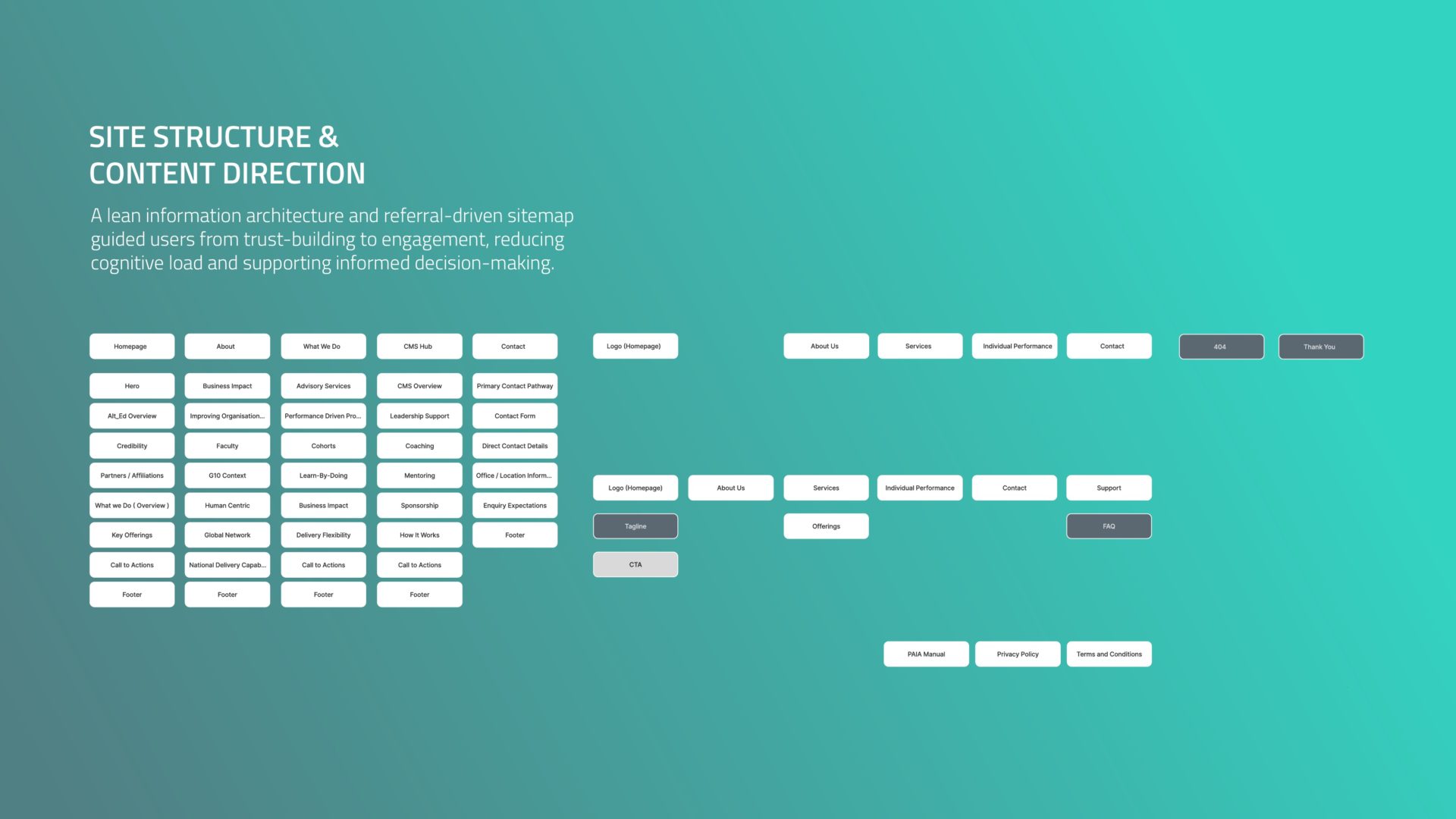
We built a lean, referral-aware information architecture, developing content and UX side by side rather than in sequence. Structure was validated through low-fidelity wireframes before any visual design began, so the harder strategic calls got made early, while they were still cheap to change. Gated resources were built around that strategy, as material a prospective champion could genuinely carry into their own conversations. The site’s logic shifted from passive browsing to active business development, doing the work of persuasion before a single meeting ever took place.
Creative ASSETS
Website