


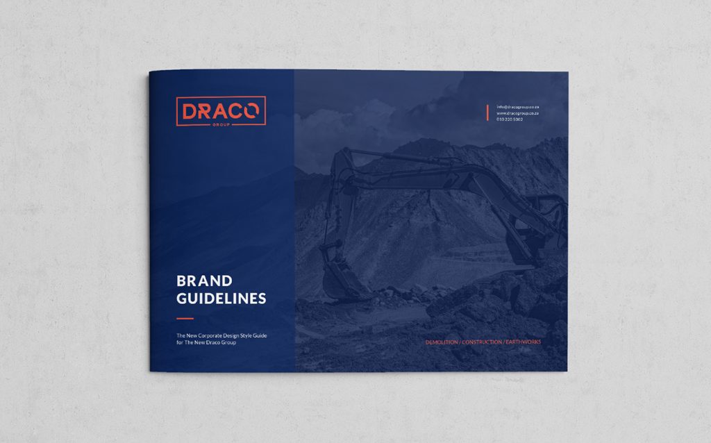

The New Draco Group
November 2018
Brand Identity
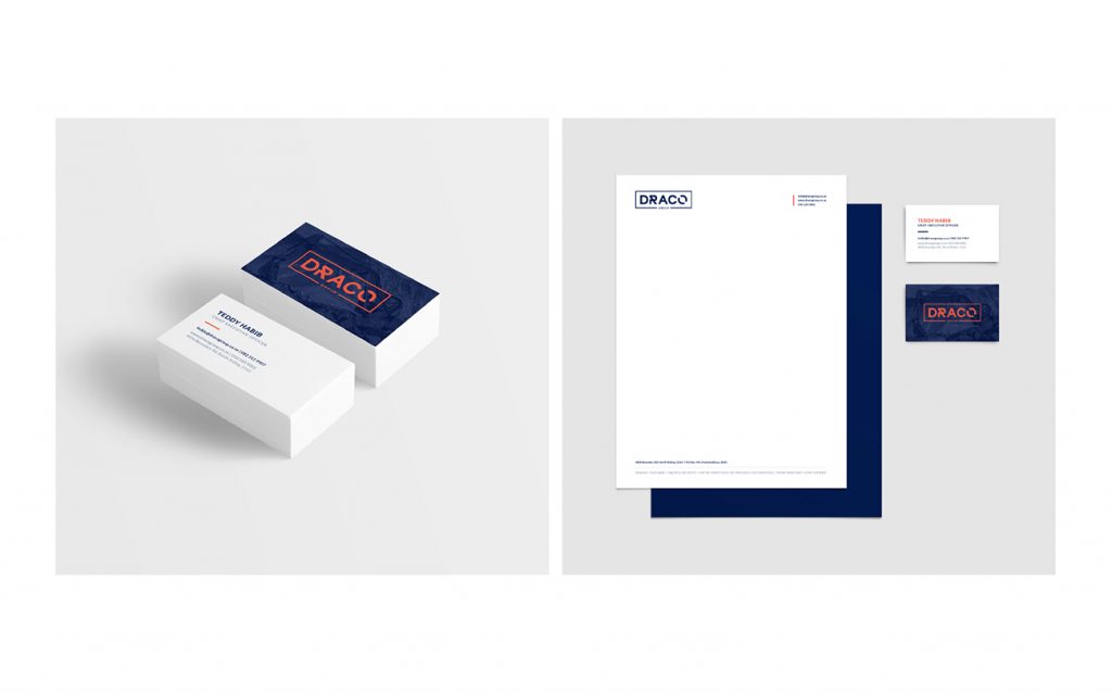
The New Draco Group is a comprehensive construction and demolition company based in Johannesburg, South Africa. The New Draco Group needed branding that would communicate their bold variety of services on offer.
Precision and trust are integral to large scale construction/demolition projects.
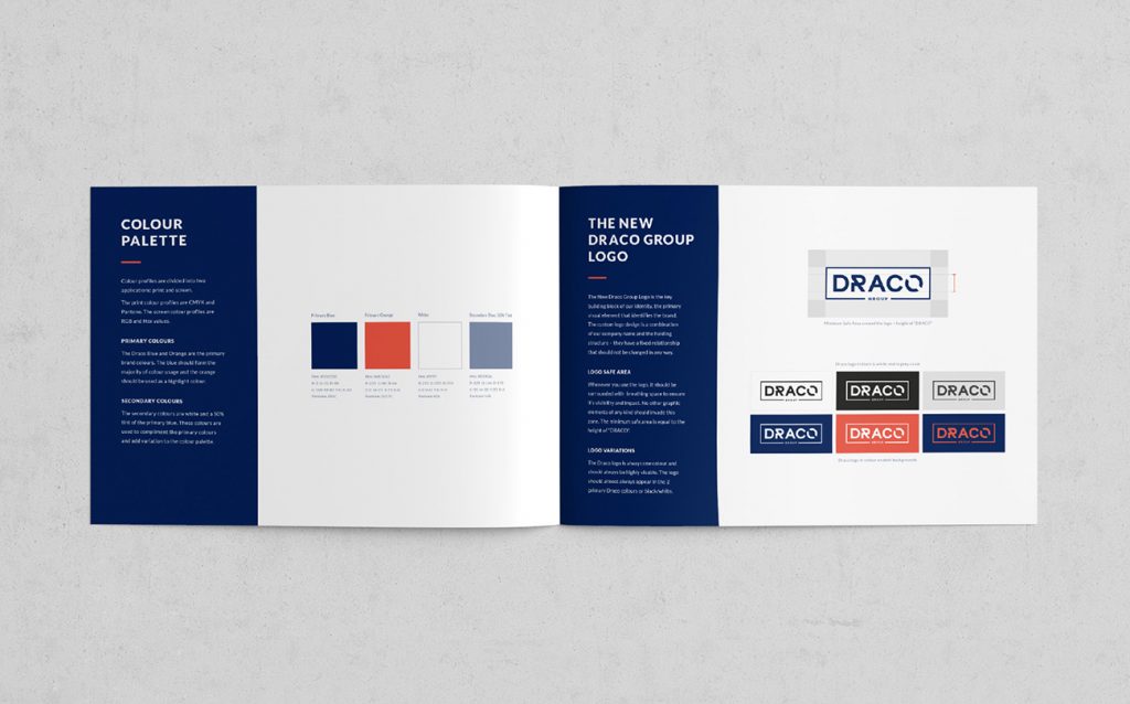
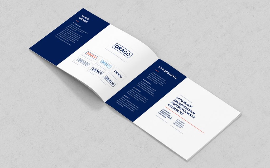
The brand identity had to be the perfect combination of corporate and construction in order to encapsulate the company’s long term goals, as well as express the power, strength and energy that The New Draco Group stands for. We chose to communicate the construction and demolition aspect of a project through borrowing parts of the O in the logo to create the R. Furthermore we framed the letters of the logo within a strong border to symbolise a building block as well as the all encompassing service menu that Draco offers.
Primary Blue
Hex: #032058
R-3 G-32 B-88
C-100 M-80 Y-0 K-50
Pantone 281C
Primary Orange
Hex: #eb5642
R-235 G-86 B-66
C-0 M-77 Y-73 K-0
Pantone 281C
White
Hex: #ffffff
R-255 G-255 B-255
C-0 M-0 Y-0 K-0
Pantone N/A
Secondary Blue: 50% Tint
Hex: #8190ac
R-129 G-144 B-172
C-55 M-38 Y-20 K-4
Pantone N/A
| Cookie | Duration | Description |
|---|---|---|
| cookielawinfo-checkbox-advertisement | 1 year | Set by the GDPR Cookie Consent plugin, this cookie is used to record the user consent for the cookies in the "Advertisement" category . |
| cookielawinfo-checkbox-analytics | 11 months | This cookie is set by GDPR Cookie Consent plugin. The cookie is used to store the user consent for the cookies in the category "Analytics". |
| cookielawinfo-checkbox-functional | 11 months | The cookie is set by GDPR cookie consent to record the user consent for the cookies in the category "Functional". |
| cookielawinfo-checkbox-necessary | 11 months | This cookie is set by GDPR Cookie Consent plugin. The cookies is used to store the user consent for the cookies in the category "Necessary". |
| cookielawinfo-checkbox-others | 11 months | This cookie is set by GDPR Cookie Consent plugin. The cookie is used to store the user consent for the cookies in the category "Other. |
| cookielawinfo-checkbox-performance | 11 months | This cookie is set by GDPR Cookie Consent plugin. The cookie is used to store the user consent for the cookies in the category "Performance". |
| elementor | never | This cookie is used by the website's WordPress theme. It allows the website owner to implement or change the website's content in real-time. |
| viewed_cookie_policy | 11 months | The cookie is set by the GDPR Cookie Consent plugin and is used to store whether or not user has consented to the use of cookies. It does not store any personal data. |
| __hssrc | session | This cookie is set by Hubspot whenever it changes the session cookie. The __hssrc cookie set to 1 indicates that the user has restarted the browser, and if the cookie does not exist, it is assumed to be a new session. |
| Cookie | Duration | Description |
|---|---|---|
| __cf_bm | 30 minutes | This cookie, set by Cloudflare, is used to support Cloudflare Bot Management. |
| __hssc | 30 minutes | HubSpot sets this cookie to keep track of sessions and to determine if HubSpot should increment the session number and timestamps in the __hstc cookie. |
| Cookie | Duration | Description |
|---|---|---|
| __utma | 2 years | This cookie is set by Google Analytics and is used to distinguish users and sessions. The cookie is created when the JavaScript library executes and there are no existing __utma cookies. The cookie is updated every time data is sent to Google Analytics. |
| __utmb | 30 minutes | Google Analytics sets this cookie, to determine new sessions/visits. __utmb cookie is created when the JavaScript library executes and there are no existing __utma cookies. It is updated every time data is sent to Google Analytics. |
| __utmc | session | The cookie is set by Google Analytics and is deleted when the user closes the browser. It is used to enable interoperability with urchin.js, which is an older version of Google Analytics and is used in conjunction with the __utmb cookie to determine new sessions/visits. |
| __utmt | 10 minutes | Google Analytics sets this cookie to inhibit request rate. |
| __utmz | 6 months | Google Analytics sets this cookie to store the traffic source or campaign by which the visitor reached the site. |
| Cookie | Duration | Description |
|---|---|---|
| CONSENT | 2 years | YouTube sets this cookie via embedded youtube-videos and registers anonymous statistical data. |
| hubspotutk | 1 year 24 days | This cookie is used by HubSpot to keep track of the visitors to the website. This cookie is passed to Hubspot on form submission and used when deduplicating contacts. |
| __hstc | 1 year 24 days | This is the main cookie set by Hubspot, for tracking visitors. It contains the domain, initial timestamp (first visit), last timestamp (last visit), current timestamp (this visit), and session number (increments for each subsequent session). |
| Cookie | Duration | Description |
|---|---|---|
| fr | 3 months | Facebook sets this cookie to show relevant advertisements to users by tracking user behaviour across the web, on sites that have Facebook pixel or Facebook social plugin. |
| VISITOR_INFO1_LIVE | 5 months 27 days | A cookie set by YouTube to measure bandwidth that determines whether the user gets the new or old player interface. |
| YSC | session | YSC cookie is set by Youtube and is used to track the views of embedded videos on Youtube pages. |
| yt-remote-connected-devices | never | YouTube sets this cookie to store the video preferences of the user using embedded YouTube video. |
| yt-remote-device-id | never | YouTube sets this cookie to store the video preferences of the user using embedded YouTube video. |
| _fbp | 3 months | This cookie is set by Facebook to display advertisements when either on Facebook or on a digital platform powered by Facebook advertising, after visiting the website. |